While working on my "Going in Circles" rugs I've been thinking a lot about color. I'm trying to use light, dark, bright and dull colors in this rug......sounds easy until you actually start looking at the colors you are choosing. Colors are only dark or light, dull or bright relevant to what they are placed next to.
Since I'm blogging from work today I'm going to try to find pictures from the net as examples of
Chevreul's Laws
The hue, value and intensity of colors change depending on their neighbors. This fact, known as Chevreul's Laws, in recognition of the 19th century French chemist who made many startling discoveries, has applications for rug hooking.
Consider the following points.
· Light colors appear more striking against black or dark colors.

· All colors appear more striking against white or light colors.

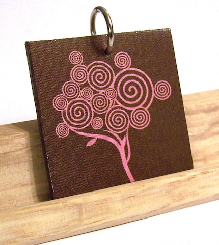
· When dark colors are set against light colors, they look darker than they do on dark colors.


· When light colors are set against dark colors, they look lighter than they do on light colors.


· When two colors are placed next to each other, each tints its neighbor with its own complement. For example, complementary colors viewed side by side seem more intense than if viewed separately.

· Dark hues on a dark ground, not complementary, will seem weaker than if seen on a darker complementary color.
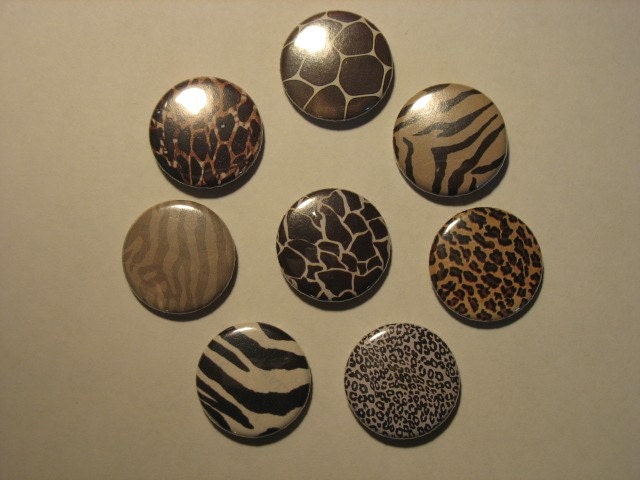
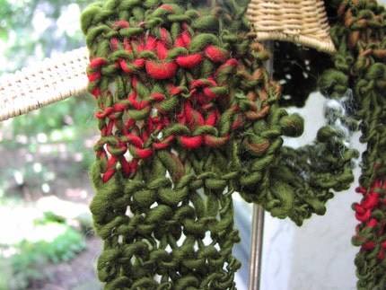
· Light hues on a light ground, not complementary, will seem weaker than if seen on a light complementary color. 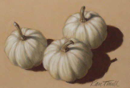

· A bright color against a dull color of the same hue will appear duller than if viewed against a dull complementary color. 

 · When a bright color is used against a dull color, the contrast will be stronger when the latter is complementary.
 · Light colors on light grounds can be greatly strengthened if bound by narrow bands of black or dark complementary colors.
 · Dark colors on dark grounds can be greatly strengthened if bound by narrow bands of white or light complementary colors.
Perhaps this weekend, when I have more time I can do these experiments with wool and post pictures of them.
Go forth and be creative,
Tammy

Very valuable information. I'd like to have that in book form. Enjoying your blog so much.
ReplyDeletekatie
primitive woolen
Wow I am going to have to study this a lot. There is a lot of information in this one posting. Thanks so much although I do think I need more coffee. Color is always a hard thing and adding values to it is challenge. Your postin gis well written with lots of photos to clarify.
ReplyDeleteThanks so much.
JoEllen
Great info Tammy and I want to study it more Maybe I can store some of it in my old head. I am finding the color of the pink print extremely hard to read my eyesight is not as good as it used to be Thanks Helen
ReplyDeleteHelen, I'll change that to a different color to make it easier to read.
ReplyDeleteTAmmy
That's so much better Tammy Thank you Now to get it all in to my head Helen
ReplyDeleteAwesome post Tammy!! I love stuff like this, learning how things work and why!! You did a great job describing it - and at work to boot?!?! lol i swear you are wonder woman in disguise!! :D
ReplyDeletexo Bren